How to Create Podcast Cover Art: Step by Step Guide
Actionable advice and tips on how to design a captivating podcast artwork.
Just as a book cover can determine whether someone picks it up, your podcast cover art can influence whether someone hits the play button on your show. In this article, we're sharing multiple tips on how to create a compelling podcast cover art, whic tools you should use, and how to that just as good as a pro designer would.
First, however, let’s cover why a well-made podcast art cover matters.
Why you need to design a podcast artwork
Having a well-designed and recognisable podcast cover art is crucial for several reasons. Here are they.
To create the first impression
Your podcast cover art is often the very first thing your listeners notice when when they come across your show on platforms like Apple Podcasts, Spotify, or other podcast directories. It serves as the initial impression of your show, so a professionally designed and visually appealing cover art immediately captures the attention and interest of potential listeners.
To build branding
Podcast cover art plays an important role in establishing your podcast's brand identity. It's a visual representation of your show's theme, tone, and style. Consistency in design across episodes or seasons helps reinforce your brand and makes your podcast memorable.
Effective cover art can even communicate the essence of your podcast—it tells potential listeners what your podcast is about, who it's for, and what kind of experience they can expect. This ensures that you attract an audience that's genuinely interested in your content.
What's more, podcast cover art is not limited to podcast directories. It's often used as the thumbnail image when your podcast is shared on social media, websites, or in email newsletters.
To stand out
The podcasting landscape is highly competitive nowadays, with thousands of new podcasts being launched regularly. Having a unique and eye-catching cover art helps your podcast stand out in a crowded market. It surely draws attention and makes your show more discoverable.
To show you take it seriously
High-quality cover art conveys professionalism, a commitment to quality, and signals to potential listeners that your podcast is worth their time and attention.
To help you stay consistent & relevant
Over time, as your podcast evolves or introduces new seasons, your cover art can reflect those changes. This allows your podcast to stay relevant and updated. Consistency in design makes it easier for existing listeners to identify your show amid other podcasts in their subscription lists.
To convey the right tone
A vibrant and colourful design may suggest a light-hearted and entertaining show, while a more minimalist and dark design might hint at a serious and informative podcast.
How to design a podcast artwork
Now let's delve into practical tips that'll help you create a captivating artwork that conveys the tone of your show and contributes to its branding.
Tip 1. Choose the right dimensions & format
The recommended podcast artwork size and specifications for podcast cover art slightly vary among different podcast directories and platforms, but the following are common standards that should work well on most platforms:
🔴 Dimensions:
- Square aspect ratio (1:1)
- Minimum recommended size: 1,400 x 1,400 pixels
- Optimal size: 3,000 x 3,000 pixels
🔴 File format:
- JPEG (preferred) or PNG
🔴 Color mode:
- RGB (Red, Green, Blue) for digital display
🔴 File size:
- Maximum file size can vary, but it's generally recommended to keep it below 512 KB.
🔴 Resolution:
- High-resolution (300 DPI or greater) for crisp and clear images.
While these specifications are generally recommended, it's essential to check the specific requirements of the podcast directories and hosting platforms you plan to use, such as Apple Podcasts, Spotify, Google Podcasts, and others, as they may have slight variations in their guidelines.
For example, Apple Podcasts, one of the largest podcast directories, recommends a minimum size of 1400 x 1400 pixels but encourages an optimal size of 3000 x 3000 pixels.
It's a good practice to create your cover art in the largest dimensions possible and then resize it to meet the requirements of different platforms. This way, your artwork will look great across the board, and you won't risk it being pixelated or distorted when displayed on various podcast apps and websites.
Tip 2. Choose a relevant theme
There's a significant bond between podcast topic and its cover art, for the cover art of serves as a visual representation of the content it encapsulates, and this connection is essential. It gives potential listeners a sense of what they can expect, which can help attract the right audience.
Podcast artwork style can and should differ depending on the podcast topic to effectively communicate the content and appeal to the target audience. We've come up with a few examples of how podcast artwork style can vary based on the podcast topic:
- News podcasts: Podcasts focused on news and current events may feature clean and straightforward designs with bold, easily readable typography. The artwork could incorporate images related to news, such as headlines, newspapers, or world maps.
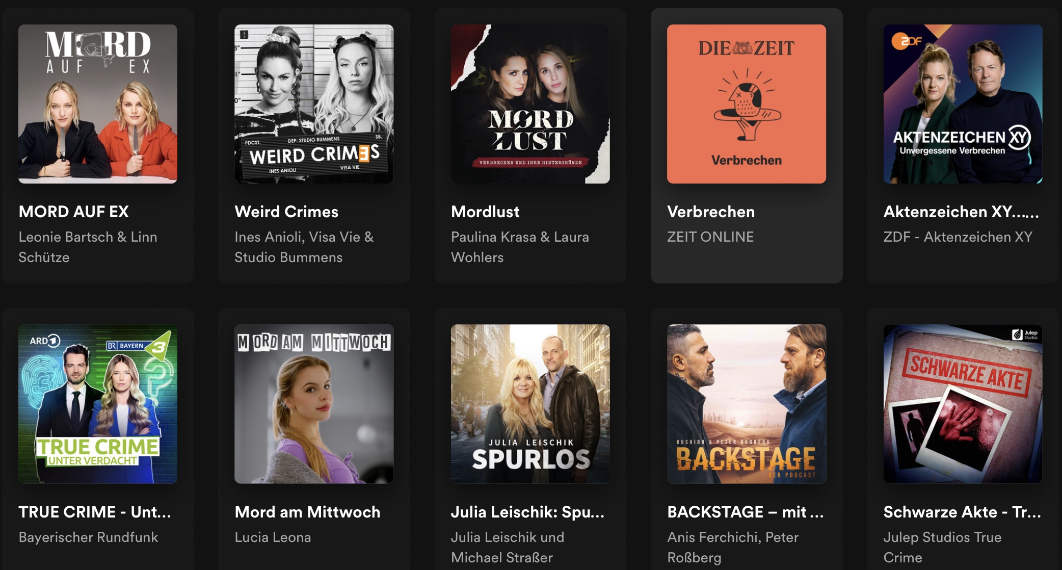
- True crime: Such podcasts often use dark and mysterious aesthetics, possibly featuring crime scene photos, forensic imagery, or elements that convey suspense and intrigue. They might also showcase the hosts on the cover.
- History: Historical podcasts might use vintage or aged visual elements, such as sepia tones or historical illustrations, to reflect the era they are discussing.
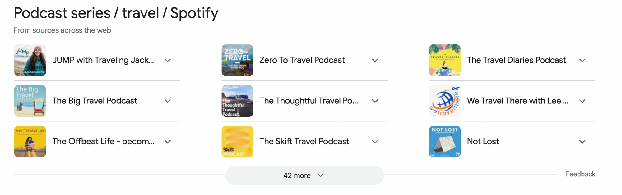
- Travel: Travel podcasts may incorporate vibrant and diverse colour palettes to represent different locations and cultures.
- Health: Podcasts addressing health and wellness issues might use calming, soothing colours, such as soft blues and greens, to promote a sense of well-being and relaxation. The artwork for these podcasts may include calming textures, like soft gradients or organic patterns, to promote feelings of health and well-being.
- Business and finance: Podcasts in this category often employ professional and clean typography to convey a sense of trustworthiness and expertise.
- Comedy: For comedy podcasts, playful and whimsical fonts and typography can evoke a lighthearted and fun mood.
- Science and technology: These podcasts might use clean, modern, and tech-inspired design elements. Geometric shapes, circuits, and futuristic imagery can be incorporated.
- Art and culture: Podcasts discussing art and culture can use artistic and creative designs, potentially featuring elements related to famous artworks, classic symbols, or representations of various art forms.
- Nature and environmental: Podcasts about nature and environmental topics can feature images of landscapes, wildlife, or natural elements like trees, mountains, and oceans.
- Horror and paranormal: Artwork for horror and paranormal podcasts can be dark, eerie, and textured to create a sense of foreboding and fear.
Tip 3. Craft a compelling yet simple design
Avoid clutter and too much detail. A clean and uncluttered design is more visually striking and easier for viewers to understand at a glance. You should also invest in high-resolution images or illustrations; low-quality visuals can make your podcast appear amateurish and unprofessional.
Tip 4. Select a distinct colour scheme
Choose a colour palette that is consistent with your podcast's branding and theme. Colours evoke emotions and can set the mood for your show. Is your podcast serious, informative, lighthearted, playful, or mysterious? The mood should align with your content.
Depending on your niche, different colours might fit. Above, we've talked about that a little.
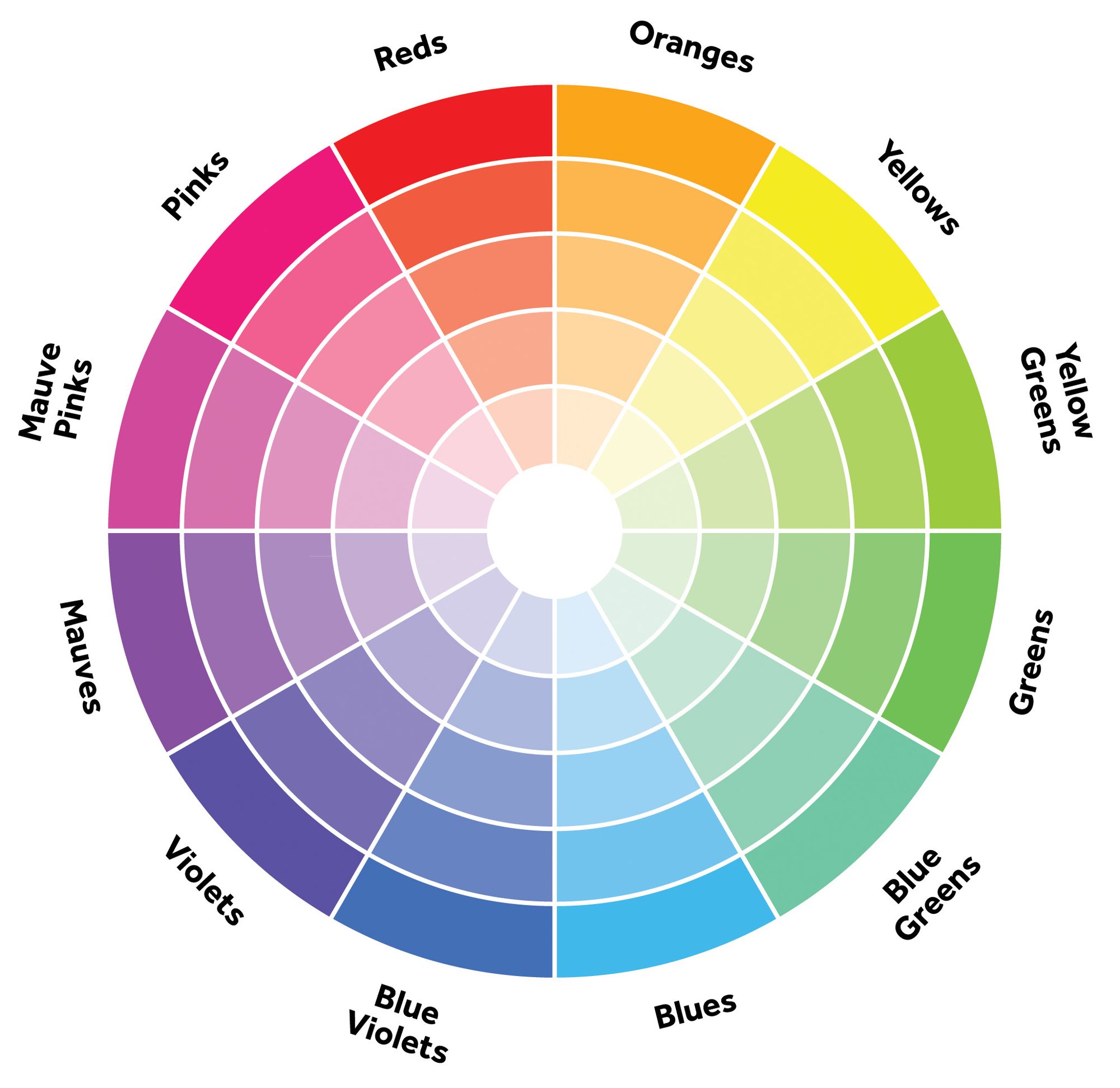
💡Consider colour harmonies and combinations. Analogous colours (colours adjacent on the colour wheel) can create a harmonious and soothing effect, while complementary colours (opposite on the colour wheel) can provide contrast and visual interest.
Tip 5. Mind typography
Use legible fonts for your podcast title and subtitle and make sure the text is clear and easy to read even at smaller sizes.
Here are some font styles that work well for podcast cover art:
Sans-serif fonts are clean, modern, and easy to read. They work well for a wide range of podcast themes, including technology, business, and lifestyle. Popular sans-serif fonts include Helvetica and Arial.
Serif fonts are known for their classic and elegant appearance. They are a good fit for podcast cover art related to history, literature, or art. Common serif fonts include Times New Roman, Georgia, Baskerville, etc.
Script and handwritten fonts can add a personal or creative touch to your cover art. They are suitable for podcasts focused on personal stories, creativity, or crafts. Examples include Pacifico, Brush Script, Great Vibes, and Playlist Script.
Display fonts are attention-grabbing and highly stylised. They can be ideal for unique and niche podcast themes, such as fantasy, sci-fi, or specific pop culture genres. Some examples are Bebas Neue, Impact, Lobster, and Playfair Display.
Tip 6. Keep text to a minimum
Avoid overcrowding the artwork with text. Stick to essential information like your podcast's name and, if necessary, a brief subtitle.
Tip 7. Test on different devices
Check how your cover art appears on various devices, including smartphones and tablets.
You'll also likely use your cover art as a thumbnail in various contexts, including YouTube, Soundcloud, your social media profiles, your website, and even on your business cards. It should be on par with a podcast logo in terms of quality and should maintain consistency with your overall branding.
It's crucial that your cover art appears appealing and legible at both large and small sizes, as well as everything in between. This is why using a large, clear font is essential; it ensures that your cover art remains clear and readable, even when reduced to thumbnail dimensions.
A practical guideline is to export your cover art design at a size of 55x55 pixels to verify that it maintains its visual appeal and readability at that specific size.
Tip 8. Add branding elements
If you have a logo or specific branding elements, incorporate them into your cover art for consistency.
Tools & software for designing
Designing podcast cover art requires the right tools and software to create visually appealing and professional-looking artwork. Here are some recommendations for both free and paid tools:
Free Design Tools:
- Canva: User-friendly, web-based graphic design tool with a drag-and-drop interface. It offers a wide range of templates and design elements suitable for creating podcast cover art.
- Picsart: A handy mobile photoshop.
- Figma: An absolute must-have for aspiring and seasoned designers alike.
- Adobe Photoshop: Suitable for creating detailed and high-quality podcast cover art. Adobe offers subscription plans for Photoshop, making it more accessible.
- Adobe Illustrator: Vector graphics editor that is ideal for creating highly detailed and scalable artwork, such as logos and illustrations. It's another Adobe product available through subscription plans.
- Picsart: A handy and super easy to use Photoshop analog in your smartphone.
DIY vs. Hiring a designer
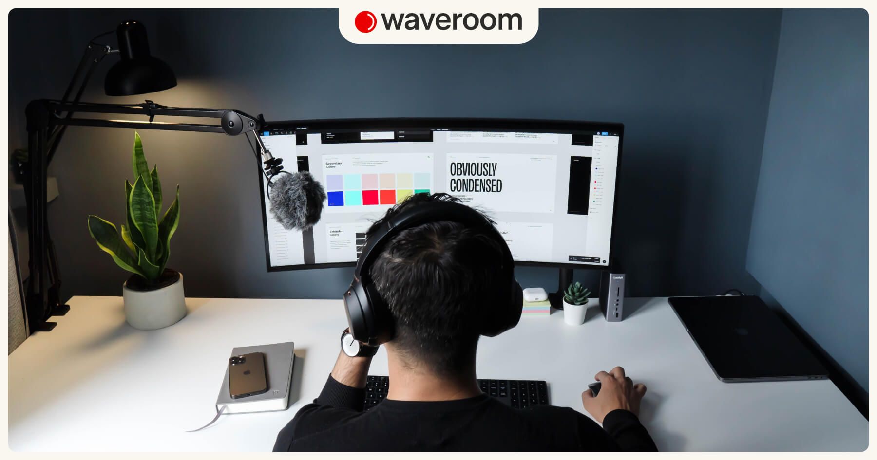
DIY design is usually more budget-friendly, as you don't have to pay a professional designer. Free design tools like Canva or Figma make it accessible to anyone. Besides, you have full creative control over the design and can experiment and iterate until you achieve the desired result without relying on external input.
Professional designer, however, can create cover art that is visually stunning and aligned with design best practices. This can give your podcast a polished and appealing image. Designers are experienced and can produce high-quality cover art efficiently, often meeting deadlines faster than someone learning design from scratch. A designer can create a set of assets that maintain design consistency across all your podcast episodes, reinforcing your brand identity.
But hiring a professional designer can be expensive, particularly for those on a tight budget. Rates can vary widely, and quality may depend on the designer's experience. If you'd better hire a pro, here are the services to take a look at:
The Podcast Design Company offers a quick turnaround, providing finished projects within three business days or less. They also provide unlimited revisions to guarantee your satisfaction, and their pricing is fixed, so you won't encounter any hidden or surprise fees.
99designs, part of Vistaprint, is a graphic design service where a team of professional designers collaborates on your podcast art project. Prices for this service range from $299 to $1,499 USD.
You can also seek for this service on Fiverr, Upwork, Behance, or Dribble.
There's more to it than just aesthetics. Unleash your creativity, embrace experimentation, and commit to continuous improvement to stregthen your podcast's branding and get discoverable at the first glance.
Follow us on our Twitter, Instagram, Facebook, and Reddit and follow us for Waveroom updates & more posts!